
We are happy to announce that the final Bricks 2.0 release is now available as a one-click update for all customers with an active license. 🥳
First & foremost, we want to take a moment to thank everyone who provided feedback for the 2.0 alpha, beta, and release candidates, as well as for any of the now 70 releases and 3,500+ new features, improvements, and bug fixes Bricks has seen since version 1.0. 🚀
We are delighted and extremely proud of how well our community-driven design & development process has been received and used by the community. Resulting in a product for you, by you. 🫶
With a total of around 300 changes throughout those pre-2.0 releases, this is by far our biggest release, and the culmination of four years of development since launching Bricks 1.0 in March 2021. 💪
Security Patch
Bricks 2.0 also includes a patch for a security vulnerability affecting versions up to and including Bricks 1.12.4.
The vulnerability is a time-based/blind SQL injection that can be triggered without authentication (CVE-2025-6495).
The vulnerability does NOT allow direct reading or modification of database contents.
Exploitation requires indirect techniques to extract data (e.g., using time-based conditions to infer information), making it complex and impractical in most real-world environments. We’ve seen no evidence of real-world exploitation.
If you are not yet ready to update your sites to Bricks 2.0, you can also apply this patch by manually downloading Bricks 1.12.5 from your Bricks account at https://my.bricksbuilder.io/
How to Update to Bricks 2.0
Due to the extensive scope of this release, we recommend testing this update on a staging or local site first before deploying it to production.
- Update your site to Bricks
2.0on a staging or local site first. - Run the “Global Elements Converter” located at
Bricks > Settings > Generalto convert any now-deprecated global elements to components. - Check the content & styling on the frontend as cascade layers are now enabled by default and may affect the styling of your site.
- If multiple users with different roles and permissions edit with Bricks, we invite you to explore the new Builder Capabilities under
Bricks > Settings > Builder Access. - Once you and/or your client have confirmed that the update went well, proceed with updating your production site.
Release Highlights
To keep this release post digestible, and because we already explored all 2.0 features in the pre-2.0 release posts, please refer to the individual changelogs below for a more in-depth explanation of certain features:
- https://bricksbuilder.io/release/bricks-2-0-alpha/
- https://bricksbuilder.io/release/bricks-2-0-beta/
- https://bricksbuilder.io/release/bricks-2-0-rc/
- https://bricksbuilder.io/release/bricks-2-0-rc2/
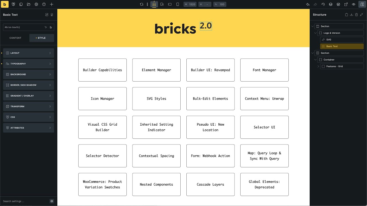
What follows is an overview of the highlights of Bricks 2.0 🤩
🧱 Builder Features & Enhancements
- Builder Capabilities (learn more)
Create fully-custom builder capabilities from 50+ granular permissions that let you control who can access which post types, content, styles, components, and more. Assign a capability to specific users and/or user roles. - Element Manager (learn more)
Enable or disable individual Bricks elements globally to streamline the builder interface and remove unused clutter. - Font Manager (learn more)
Manage and preview all your fonts directly within the builder. Download any Google Font with one click to host it locally. Manage all your Custom Fonts, Adobe Fonts, and save them as Favorites for instant access without searching. - Icon Manager (learn more)
Upload and organize (SVG) icon sets inside the builder, including preview, search, and visibility controls. Disable any icon set with one click, including built-ins. - Command Palette (learn more)
A fast search-based command runner (CMD/CTRL + K) to quickly navigate to core parts of the builder (scope: builder). Browse, create, and duplicate any post type (scope: builder), and insert elements or entire structures (scope: elements). - Element: Quick Access Bar (learn more)
Quickly navigate between the element tabs and control groups—100% keyboard-accessible.
🎨 Styling, Layout, and Visual Control
- Visual CSS Grid Builder (learn more)
Design CSS grids visually with drag-and-drop support for rows, columns, and even looped content. - Inherited Setting Indicator (learn more)
See whether a property is inherited from a class, breakpoint, or pseudo-element—click to jump to the source. - Selector UI: Visual Styling for Any Element (learn more)
Target and visually style any selector within any element. - Selector Detector (learn more)
Select any node inside the currently active element on the canvas to style it 100% visually through the new Selector UI. - Pseudo Classes/Elements: New Location (learn more)
Pseudo states (:hover,:after, etc.) are now part of the new Selector UI. - Theme Styles: Loading Methods (learn more)
Choose between loading only the most specific (= default) or all matching theme styles. - Theme Styles: Stylesheets (learn more)
Add your own CSS to any Theme Style under the new “Stylesheet” control group. - Theme Styles: Contextual Spacing (learn more)
Adjust the default spacing for a clean slate and a consistent, flexible spacing system. - SVG Styles: Breakpoint & Class Support (learn more)
Style your SVGs visually (height, width, stroke-width, stroke-color, fill) on any breakpoint and global class. - Classes & Variables Dropdown: Toggleable Categories (learn more)
Organize class and variable lists by toggling categories—helps manage complex styling systems.
🔧 Workflow & UX Improvements
- Builder UI: Revamped (learn more)
Cleaner interface, reorganized controls, more contrast, and consistent design language across all panels. - Bulk-Edit Elements (learn more)
Select multiple elements to style, wrap, or reposition them simultaneously. - Context Menu: Unwrap (learn more)
Right-click to “unwrap” an element from its container, flattening the structure in one click. - Variable Manager: Color Editor (learn more)
Edit and preview color variables visually. - Hide Element (Builder/Frontend) (learn more)
Instantly hide elements from both the builder and the frontend via a simple toggle. - Orphaned Elements Scan & Review (learn more)
Detect and clean up disconnected or broken builder elements from older or faulty templates. Runs on every builder load. Site-wide check underBricks > Settings > Orphaned Elements Review
🧩 Components & Structure
- Nested Components (learn more)
Reuse components within components—enabling modular layouts and streamlined updates. - Components Leave Experimental Stage (learn more)
The previously experimental feature is now stable and can be used in production. - New Property Types for Component Variations (learn more)
Add toggles, selects, and global class pickers to your components to make them even more dynamic and customizable.
⚙️ Performance & Technical Changes
- Builder: New Render Logic (learn more)
Under-the-hood rendering improvements reduce load times and improve responsiveness during editing. - BREAKING CHANGE: Cascade Layers Enabled by Default (learn more)
CSS Cascade Layers are now active, meaning theme styles, user styles, and component styles are properly isolated. - DEPRECATED: Global Elements (learn more)
Components have replaced global elements. Existing global elements are still rendered for now, but no longer supported, and no new global elements can be created. A Global Elements Converter is available under Bricks > Settings > General.
🛠️ Element-Specific Enhancements
- Form Element: Webhook Action (learn more)
The new form action, “Webhook,” allows for direct integration with third-party services through form submissions. - Map Element: Query Loop & Sync with Query (learn more)
Configure a query loop directly on the map or sync with another query loop for dynamic location rendering. Map Clusters are supported. Custom markers, in text or image format, can be set using dynamic data for every map location. - WooCommerce: Product Variation Swatches (learn more)
Built-in visual swatches (types: color, image, text label) for variable products enhance store presentation and user interaction. - Interactions for WooCommerce Events (learn more)
Add custom interactions for WooCommerce events, such as ‘Added to cart’, ‘Remove from cart’, ‘Cart updated’, ‘Coupon applied’, and ‘Coupon removed’.
We hope you enjoy the most significant update and take some time to explore and integrate the new features and workflows into existing and new Bricks site builds 🔥
Full changelog
- Filter Source: WordPress field support Term Name and User NameImprove
- Font Manager: Display font file nameImprove
- Icon Manager: Remove icons from bricks_custom_icons db options when set is deletedImprove
- Map element: Zoom field support dynamic dataImprove
- Masonry Layout: Support inside mega menu (dropdown)Improve
- Theme styles: Improve position inside Typography popupImprove
- Toolbar: Add back “Pages” iconImprove
- WooCommerce events: “Adding to cart” triggerImprove
- Checkbox & radio input: Use cursor: pointerImprove
- Structure panel: Use “title” attribute instead of tooltip for element state iconsImprove
- Builder: Template conditions select control behind search barFix
- Bulk editing: Wrong number of selected elementsFix
- Bulk select: Elements still selected after removing the parentFix
- Bulk select: wrong order once movedFix
- Canvas: Icon rendering issue when changing sourcesFix
- Cascade layers: Select field in Woo checkout is styled wronglyFix
- Command Palette: @element insertion positionFix
- Component categories title: Space closes dropdown and clears inputFix
- Component toggle property connected to “hide in builder”: Element always hidden if default set to trueFix
- Components: Empty settings panel when selecting non-active componentFix
- Dropdown: Content with align-self: center won’t show correctly on the borderFix
- Font Manager: Fix various RC2 bugsFix
- Font Manager: Duplicated items in “font family” dropdown in some casesFix
- Nav Nestable: “li” element has same ID and attributes as “Menu Link”Fix
- Nested component: Global class style not generatedFix
- Nested query loop: Issue with rendering in the builderFix
- Query loop: Quickly enable, then disable loop leaves items on the canvasFix
- Sync Global Classes: Object object error and other issuesFix
- Tabs Nestable: Clicking on a tab removes the background color in the builderFix
- Tabs Nestable: Content pane is always hidden when clicking on Pane blocks (in builder)Fix
- Template insert fails if template doesn’t have a theme styleFix
- Toggle element: Keep open while styling on offcanvas or nav, is-active class not added (in builder)Fix
- Variable Manager: Color Slider not sync with input field valueFix
- Variable Manager: Selected variable export is missing the variable objectFix
- Nestable slider: Selecting a slide changes slide width on canvasFix
- WooCommerce 10.0.0: Outdated WooCommerce cart templateFix
- Class manager: “Nothing found” displayed before classes are loadedFix
- Class manager: Using CMD-Z in undo (elements) historyFix
- Create component: Custom CSS original ID is kept (root element)Fix
- Custom Font: If it’s the same name as Google font, it will load bothFix
- Full Screen CSS: Always applies to “desktop” breakpointFix
- Hide element: Don’t show Modified control searchFix