
We’re super excited to share this first alpha release of Bricks 2.0 with you today, which you can now download from your account at https://my.bricksbuilder.io/?alpha=2.0.
Version 2.0 lays the foundation for professional-grade site building with Bricks in 2025 and beyond by bringing the most-requested features to life, with a combined total of more than 30.000 upvotes.
This release focuses on bringing new core functionality inside the builder and improving many existing features for more productive and powerful workflows when building with Bricks.
The upcoming beta and release-candidate builds will refine and polish.
Your feedback matters
This is an early-stage build, so some rough edges are to be expected. Please share any bugs, possible improvements, or anything that feels off on the forum (https://forum.bricksbuilder.io/) or via email (help@bricksbuilder.io). As always, your input will help shape the final product. 🙏
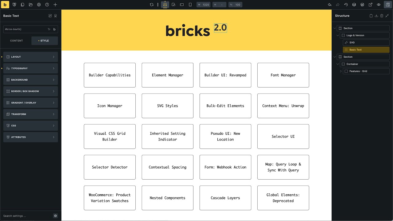
Lets explore the highlights of this release together, starting with …
Builder Capabilities
Prior to Bricks 2.0, controlling the builder access, be it for team members or clients, was very limited.
You could only choose between three predefined options of “Full Access”, “Edit Content”, and “No Access”.
Although this might have been sufficient in the early days of Bricks, with the continued stream of new features, the need for much more flexible and fine-grained builder access permissions grew as well.
Version 2.0 solves the builder access dilemma by introducing “Builder Capabilities”.
A visual interface, available in your WordPress dashboard under Bricks > Settings > Builder Access, lets you create your own builder capabilities where you can fine-tune permissions for a specific user or user role.

Builder capabilities let you set 50+ individual permissions for the following areas:
- Post types: Select which post types can be edited using Bricks.
- General: Access to specific Bricks features (Icon Manager, Font Manager, Breakpoint Manager, etc.)
- Templates: Define the template editing capabilities.
- Global styles & settings: Access to theme styles, color palettes, global class & variables manager, etc.
- Components: Define the component editing capabilities.
- Element editing & styling: Access to query loops, content and/or style settings, etc.
- Edit elements: Set element editing permissions.
- Add elements: Set element adding permissions.
Element Manager
Not every Bricks site needs all 110+ native elements. You might want to disable certain elements for a more streamlined, productive workflow or to remove the elements that you won’t want to be used on your site for best-practices, performance-reasons, etc. This is now possible with the new Element Manger.
Located in your WordPress dashboard under Bricks > Elements, you can set the status of every element, be in Bricks-native or custom, to one of the following three options:
- Active: Element is visible in the builder and frontend. This is the default behaviour.
- Hidden (Builder): Element is not visible in the builder elements panel, but still rendered in the builder and frontend. Elements can also still be added through imports, copy & paste, etc. This option is just meant to declutter the elements panel, not to disable the element.
- Disabled: A disabled element is not loaded in the builder nor on the frontend.
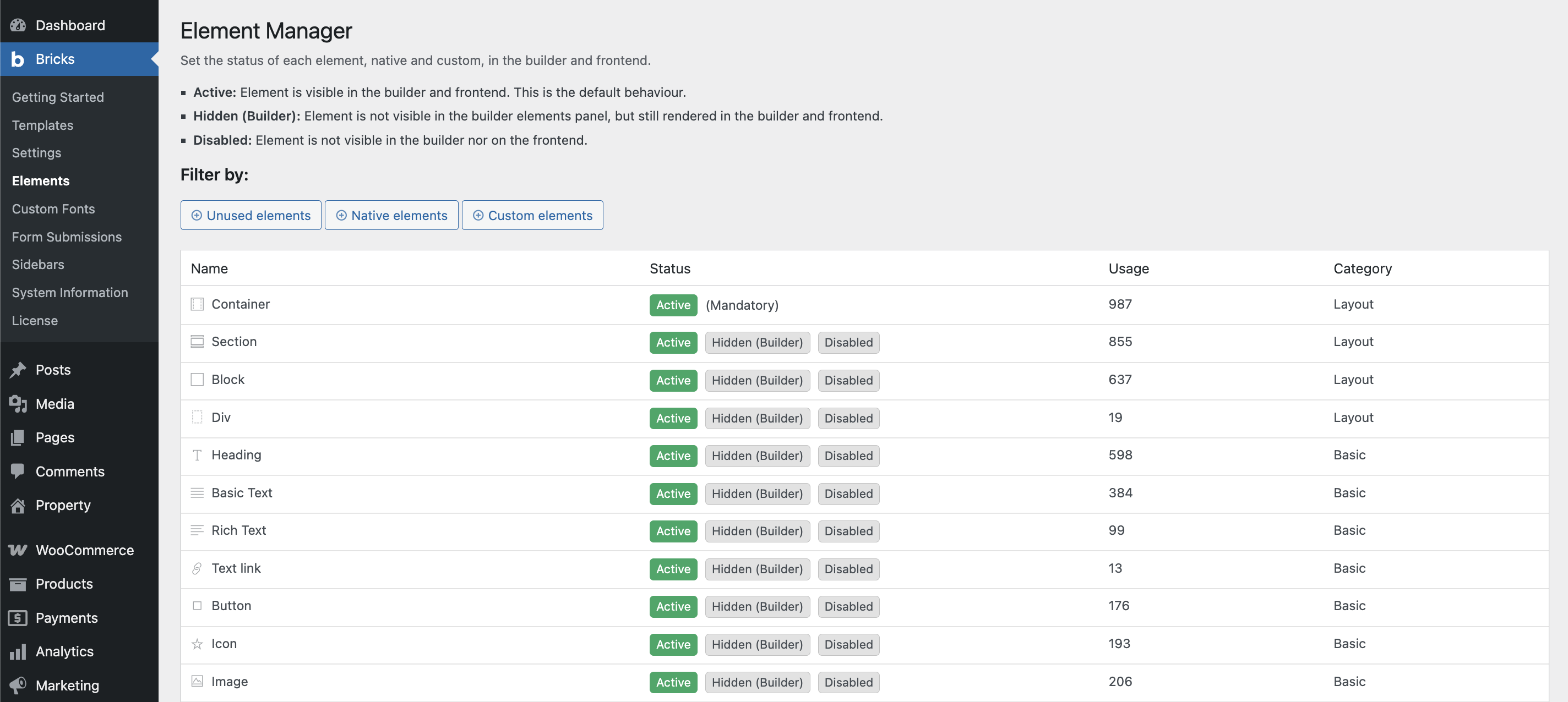
Elements can by filtered by:
- Unused elements
- Native elements
- Custom elements
The Element Manager settings precede the Builder Capabilities. Meaning if an element is disabled, even though, you’ve enabled it in the “Add element” section of a Builder Capability, it won’t be available for insertion.
Builder UI: Revamped
We ever so slightly revamped the builder interface for improved readability through more contrast; tweaked the look of control groups & structure panel; cleaned-up the theme style panel with all individual elements organised under the “Elements” group; and actual dark preloading screen; and the pseudo class UI found a new home outside the builder toolbar, etc.
Font Manager (In-Builder)
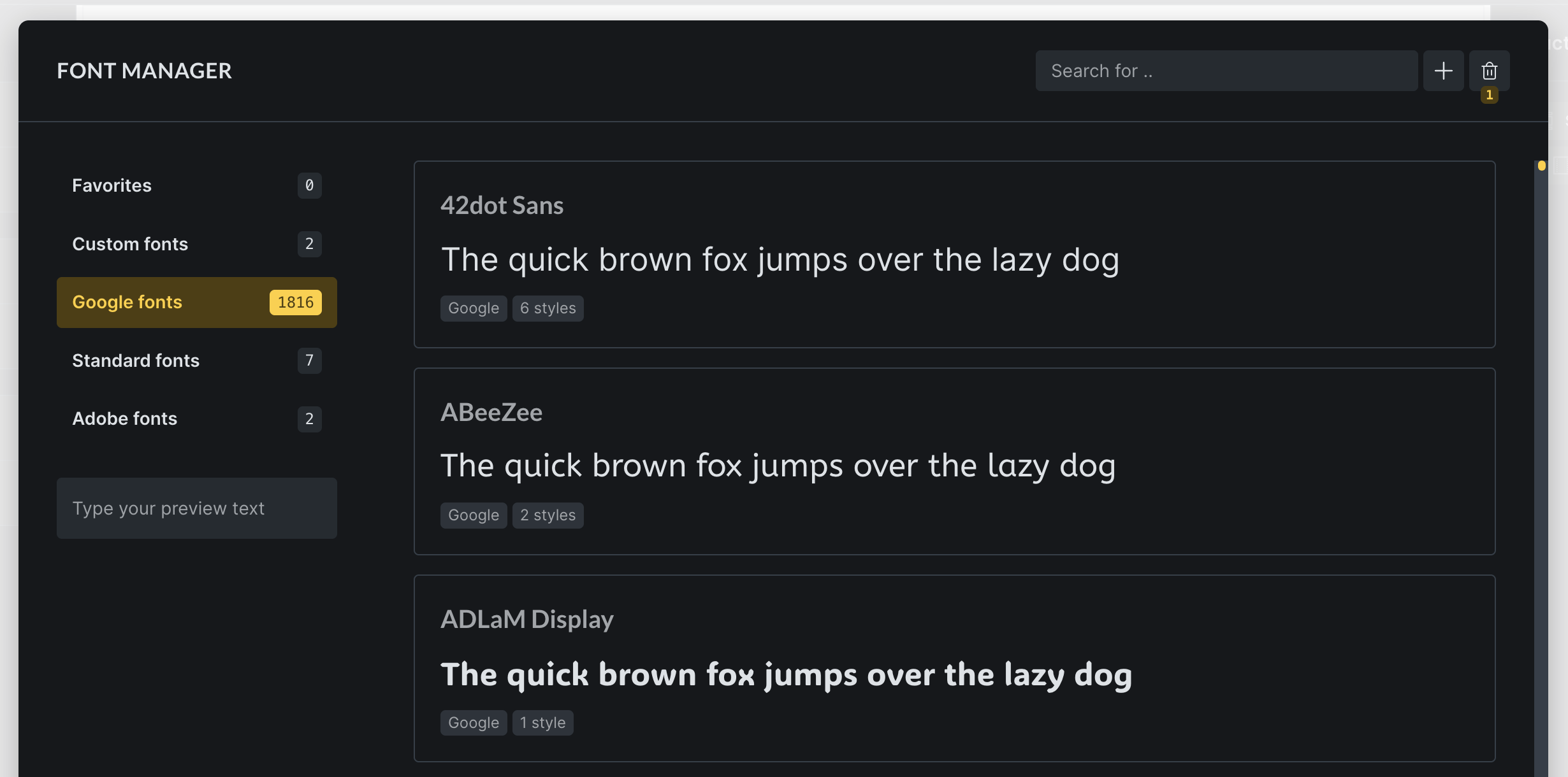
The all-new Font Manager, which is accessible in the builder under Settings > Font Manager or by clicking the gear icon on any font-family panel control, allows for a professional-grade font adding & managing experience.
- Quickly create custom fonts by uploading all your font variation files in one step.
- Browse & download any Google Font with one click to host it locally (GDPR-compliant).
- Favorite individual fonts to restrict the selection of font families in the builder.
- Move fonts to the trash without deleting them right away.
Icon Manager (In-Builder)
Creating and managing your own custom icon sets (collection of SVG files), is now possible thanks to the new Icon Manager in Bricks 2.0.
You can access it inside the builder under Settings > Icon Manager or by clicking the “gear” icon next to any icon control.
Functionalities:
- Create custom icon sets (upload your own SVG files)
- Use those icon in any icon control and the SVG element
- Style the height, width, stroke-width, stroke-color, and fill of your icons
- Disable any icon set, also built-ins (icons already set will show and render)
SVG styles: Breakpoint & class support

Prior to version 2.0 setting, styles on an SVG icon was only possible for the base breakpoint. Other breakpoints had to be styled using custom CSS.
We have removed this limitation. You can now set the styles of an SVG (height, width, stroke-width, stroke-color, fill) for any breakpoint and global class.
The icons (SVGs) of your custom icon sets are also supported.
Bulk-edit elements
Another massive workflow enhancement. Bricks now supports selecting and editing elements in bulk.
To select multiple elements press CMD/CTRL and click on the elements you want to edit in bulk on the canvas or structure panel.
Additionally, also hold down the SHIFT modifier key to select all elements between the selected elements.
Supported bulk-edit actions
The available bulk-edit actions depend on the elements you have selected.
If all selected elements are of the same name, i.e. you selected three headings, then you can bulk-edit the STYLE and CONTENT tab. Otherwise, only STYLE tab settings are available.
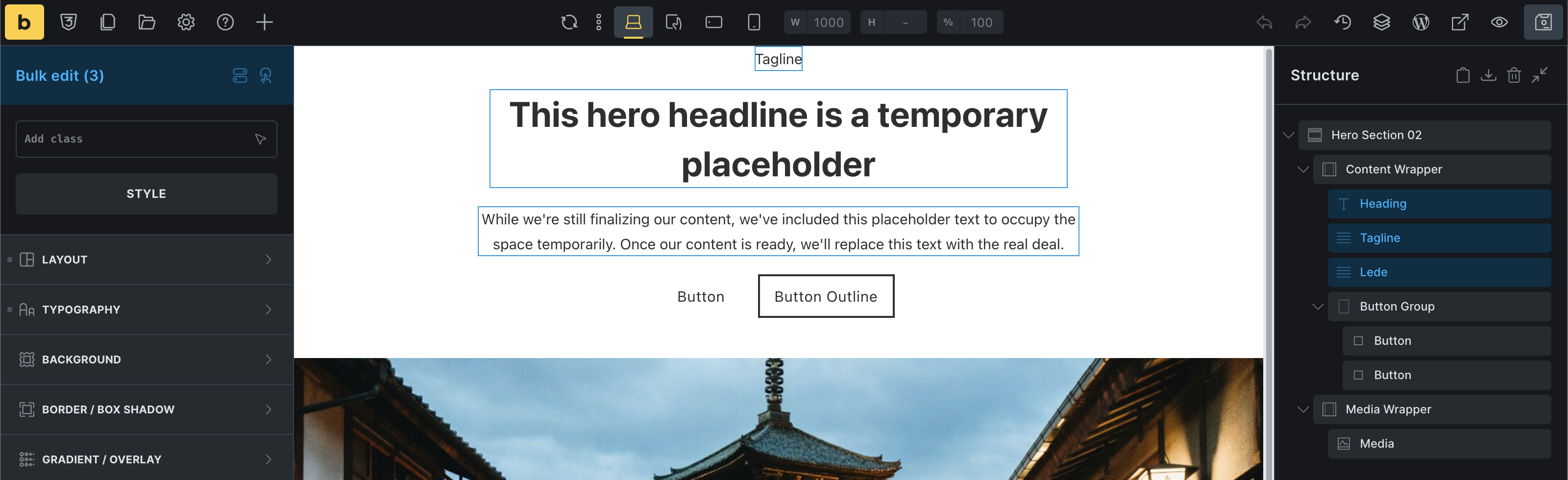
Besides editing, you can also move elements in bulk, if they are all located under the same parent element.
You can also duplicate, delete, and wrap selected elements.
Assign global classes in bulk is also possible. Existing global classes aren’t displayed while bulk-editing as every selected element can and most likely has different classes set.
Context menu: Unwrap
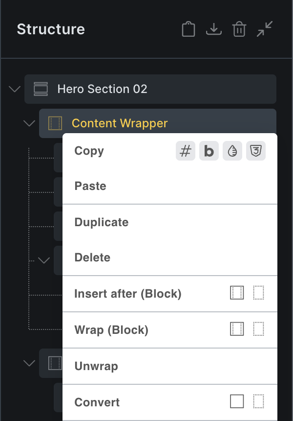
Select any nestable element, right-click on it, and use the new “Unwrap” action in Bricks 2.0 to remove the selected element and move all its children in its place.
Visual CSS Grid Builder
Documentation: https://academy.bricksbuilder.io/article/visual-grid-builder/
Building CSS grid layouts in Bricks, while possible for a long time through simple text inputs, was never the easy or pleasant experience it should have been.
And if you weren’t familiar with the all CSS grid rules, creating grid layouts was often a painful process of trial-and-error.
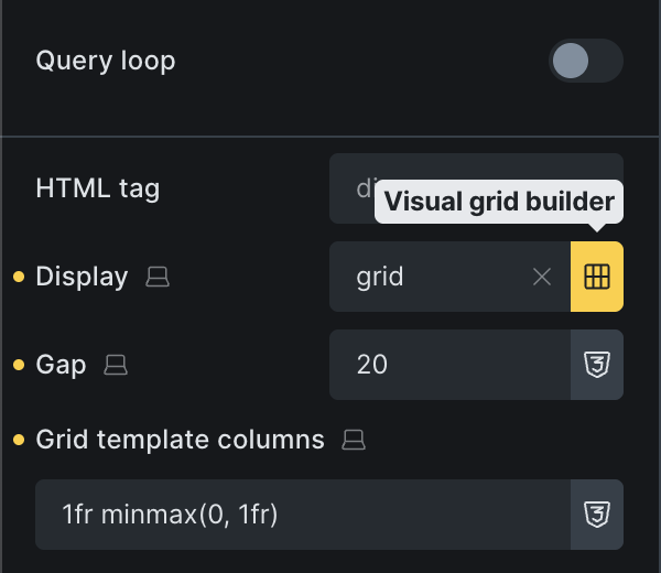
Bricks 2.0 makes designing grid layouts a breeze through the new Visual CSS Grid Builder, which you can access through the “grid” icon next to every “Display” control, if the display value is set to grid.
Clicking the icon opens up the new CSS grid builder in fullscreen, where you can visually view and modify your grid layout to your liking, without writing any code yourself.
The visual grid builder interface
Once opened, you’ll see a visual representation of your currently selected grid layout. From here you can easily adjust the columns and rows definitions, and the gap.
To resize an individual grid item just hover over it, then drag it on any of its four corners to your desired size.
To move a grid item just drag and drop it wherever you want to position it.
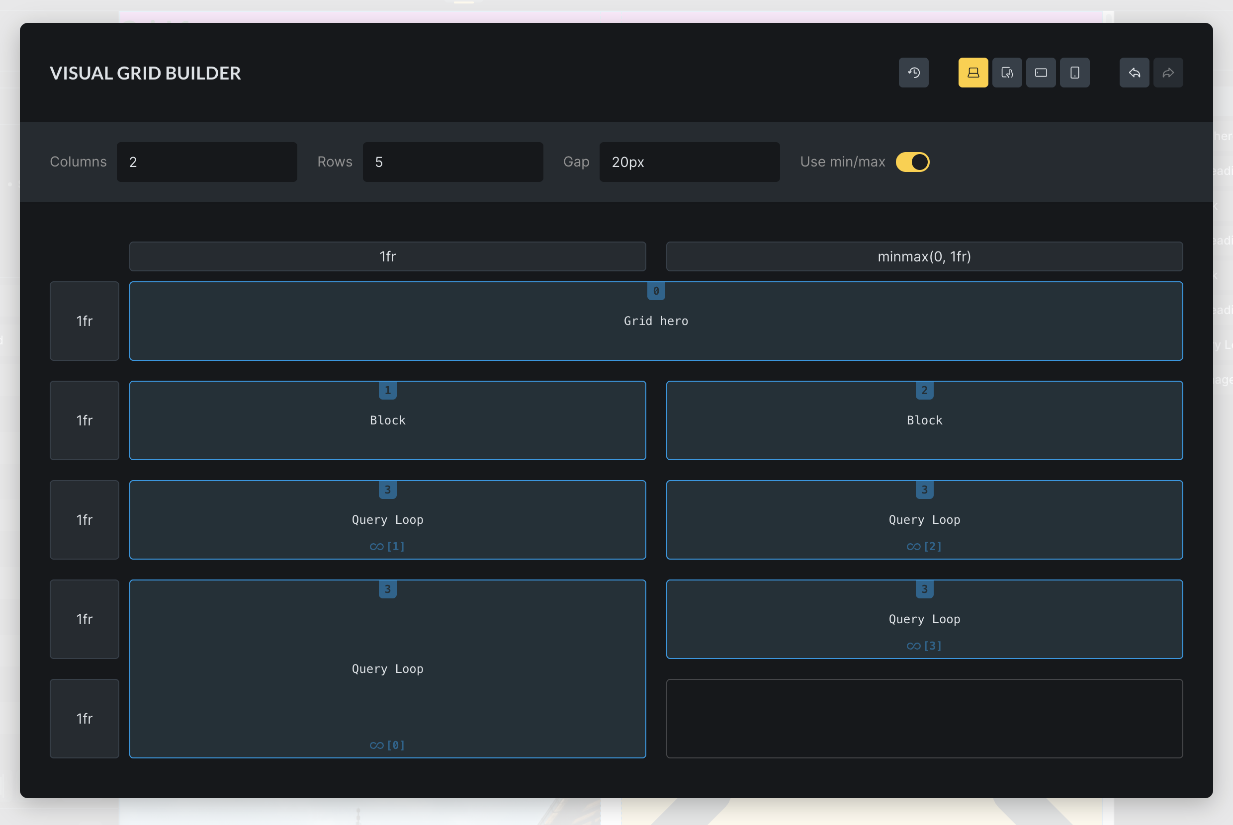
As you can see in the screenshot above, the grid builder also has full query loop support.
The generates styles for a query loop grid item are added to the “Custom CSS” section of the grid layout element and look something like this:

Inherited setting indicator
Considering that you can define settings not just on different breakpoints, but also classes, hunting down where a specific setting was inherited from and then to edit or remove it, used to be an extremely manual and time-consuming process of switching between breakpoints and classes until you finally found (or not) the inherited setting.

Bricks 2.0 brings an end to this by introducing the inherited setting indicator.
This new, square-like Inherited setting indicator is displayed on the control group title and individual control level whenever an inherited setting has been detected, either from another breakpoint and/or global class/ID.
Simply hover over the indicator to see the class/ID and breakpoint the setting is inherited from.
Clicking the inherited from selector automatically switches to the correct breakpoint and class/ID, so you can perform any necessary changes.
The screenshot on the left illustrates the “Font size” value being inherited from a class named .inherit-icon on the Tablet portrait breakpoint.
Pseudo class/elements: New location
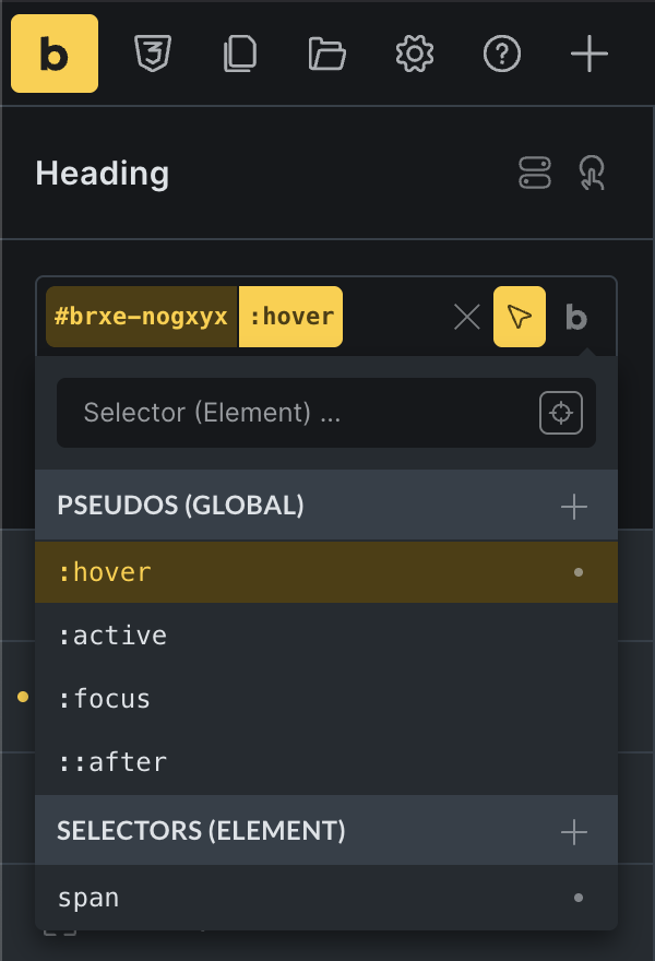
The pseudo-class interface was another area in dire need of an overhaul in Bricks 2.0.
So we moved it from its disjointed location up in the top toolbar, into the Selector UI.
Access it by clicking the “cursor” icon on the right-hand side of the current selector (as shown in the screenshot on the left).
Selector UI: Visual Styling for Any Element
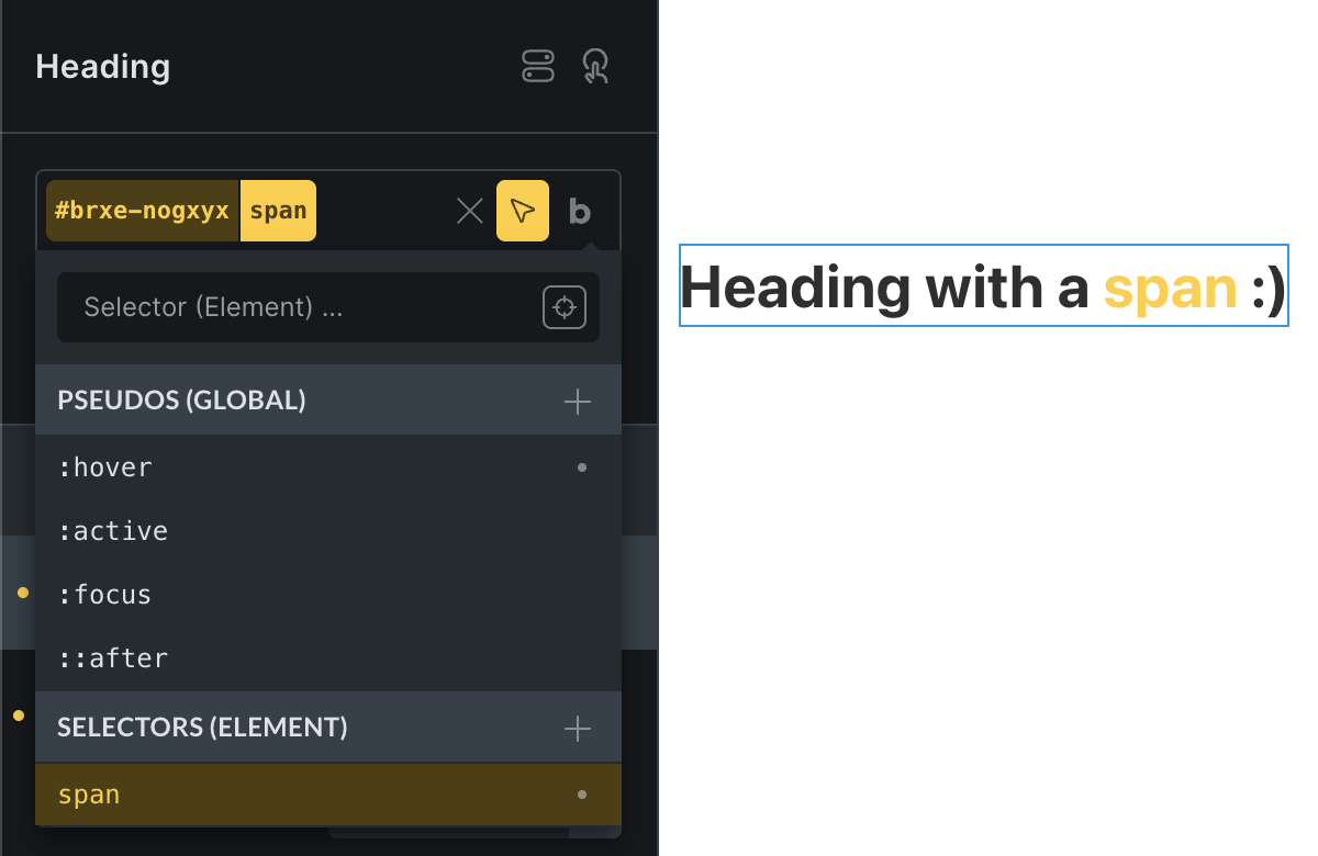
We also introduce the completely new “Selector UI” that lets you define custom selectors to target and visually style any part of an element.
A feat which was previously only possible by writing your own custom CSS.
The new Selector UI comes in super handy, especially for complex elements that aren’t nestable elements, like the Form element, or any HTML rendered through a shortcode or the Template element.
As you can see in the screenshot below, we are editing a Heading element, which has the text “span” wrapped in a <span> HTML tag.
We can now create a custom selector to target this “span” and changed the text color, or any other available style, visually under the Style tab. No more custom coding required.
Selector Detector
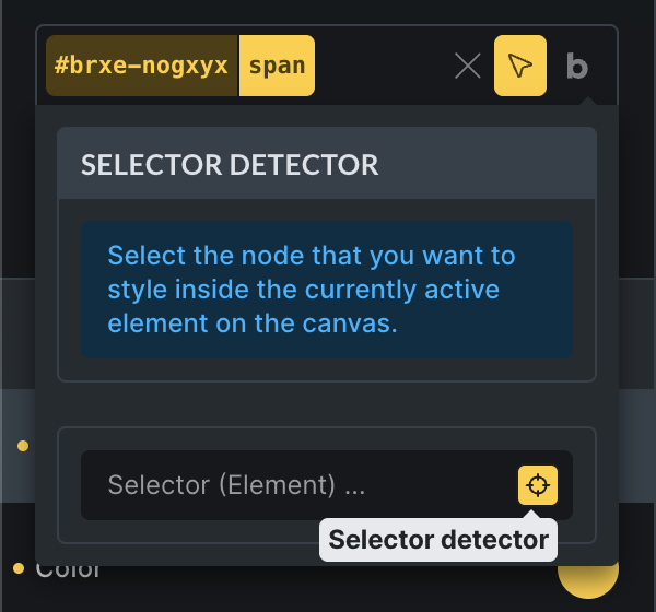
A feature originally pioneered by Oxygen, and a perfect addition to the new Selector UI, is the new Selector Detector, which lets you select any node inside the currently active element so that you can then style it visually through the new Selector UI. No switching to the frontend and inspecting the DOM required to find the correct selector.
How to use the Selector Detector:
1. Enable the Selector Detector by clicking the “target” icon on the right-hand side of the Selector UI input.
2. Select the HTML node that you want to visually style on the builder canvas.
In our example, we selected the “span” inside our Heading element:
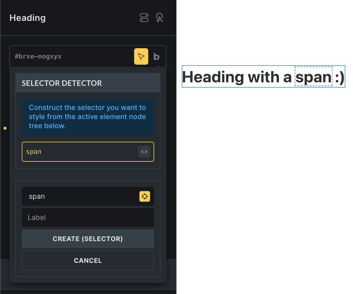
3. Click “Create (Selector)” to create a custom selector for the selected node.
You can also hover over the “code bracket” icon to choose a different selector (element “id”, classes, or the HTML tag).
4. You can now visually style this node to your liking.
Contextual Spacing
The new Contextual Spacing feature puts you in charge of the vertical rhythm inside embedded content—headings, paragraphs, lists and more—without having to hack away at browser defaults or Bricks’ built‑in styles.
Once you have selected the HTML tags for which you want to “Remove default margins” under Settings → Theme Styles → Contextual Spacing, Bricks zeroes out all of their top and bottom margins site‑wide.
You can then set custom top margins for headings, paragraphs and a fallback for anything else, and even add your own selectors (ul, blockquote, .my‑class, etc.) or wrapper classes (like .contextual‑spacing) so every piece of content obeys the same spacing rules.
This gives you a clean slate and a consistent, flexible spacing system: the first element in a block has no unintended gap above it, but every subsequent element is spaced exactly as you designed.
Whether you’re styling WordPress post content, WooCommerce product descriptions, or a complex mixed layout combining headings, text, images and dynamic content, Contextual Spacing ensures your vertical spacing is predictable, easy to adjust visually in Theme Styles, and completely under your control.
Documentation & examples: https://academy.bricksbuilder.io/article/contextual-spacing/
Form element: Webhook action
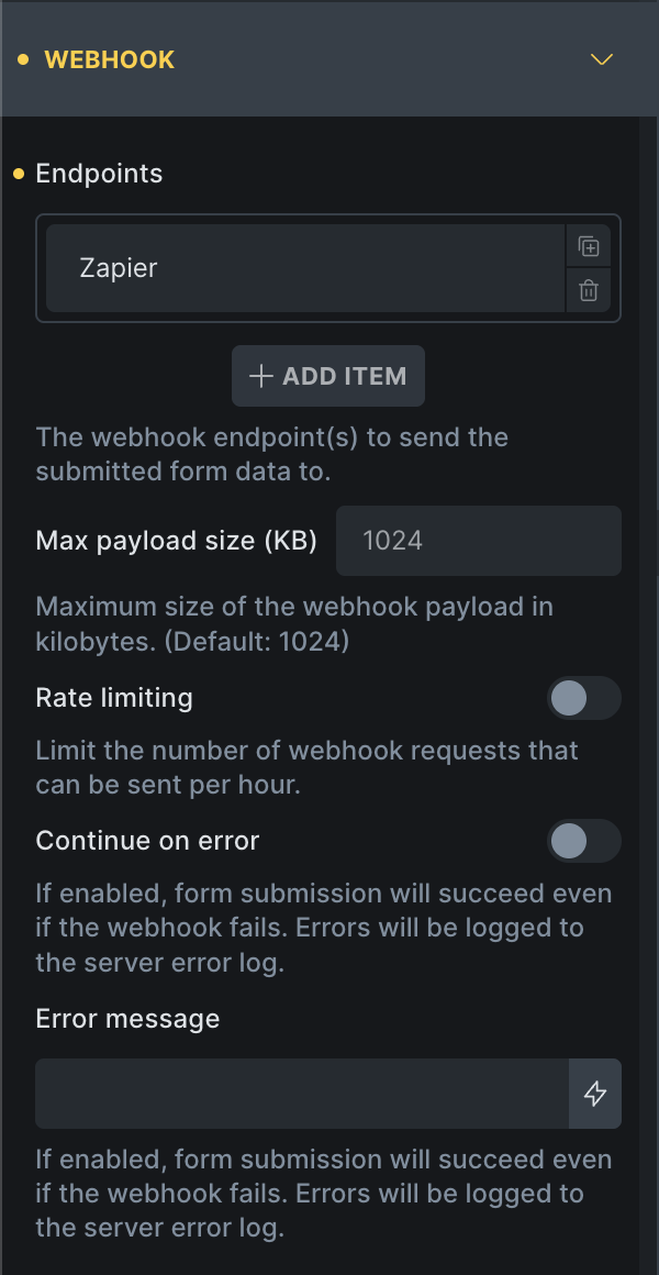
The new “Webhook” form action lets you send submitted form data to one or more external URLs.
Typical use cases include:
- Sending leads to CRMs like Zoho, Hubspot, or Salesforce
- Triggering Zapier or Make scenarios
- Storing form data in Google Sheets or external databases
- Notifying internal tools via a custom API or Slack bot
Documentation: https://academy.bricksbuilder.io/article/form-element/#webhook
Map element: Query Loop & Sync with query
Bricks 2.0 opens up a completely new level of usage for the Map element through Query Loop & Sync with query capabilities.
Documentation: https://academy.bricksbuilder.io/article/map-element/
Query loop
Now you can configure a query loop directly on the Map element and populate the address/coordinates through dynamic data.

Sync with query
Setup a Sync with query map to show an interactive map alongside a dynamic query loop as you can find it on most property listing or directory sites.
Sync with query allows the map to update in real-time according to the query results as users interact with it through AJAX Pagination, Load More, and Query Filters.

Other new map features
- Marker cluster
- Disable clickable POI
- Map ID (Google Cloud Console)
- Create full custom info boxes (via popup template)
WooCommerce: Product variation swatches
Bricks 2.0 introduces product variation swatches, giving you more control over how product attribute options such as color or size appear on the frontend.
Instead of the default dropdowns, you can now display your product variations as color swatches, image buttons, or custom labels, creating a more visual and intuitive shopping experience.
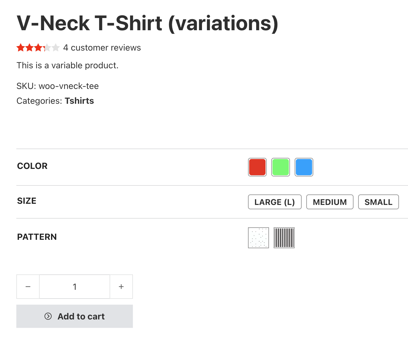
Documentation: https://academy.bricksbuilder.io/article/product-variation-swatches/
Nested components
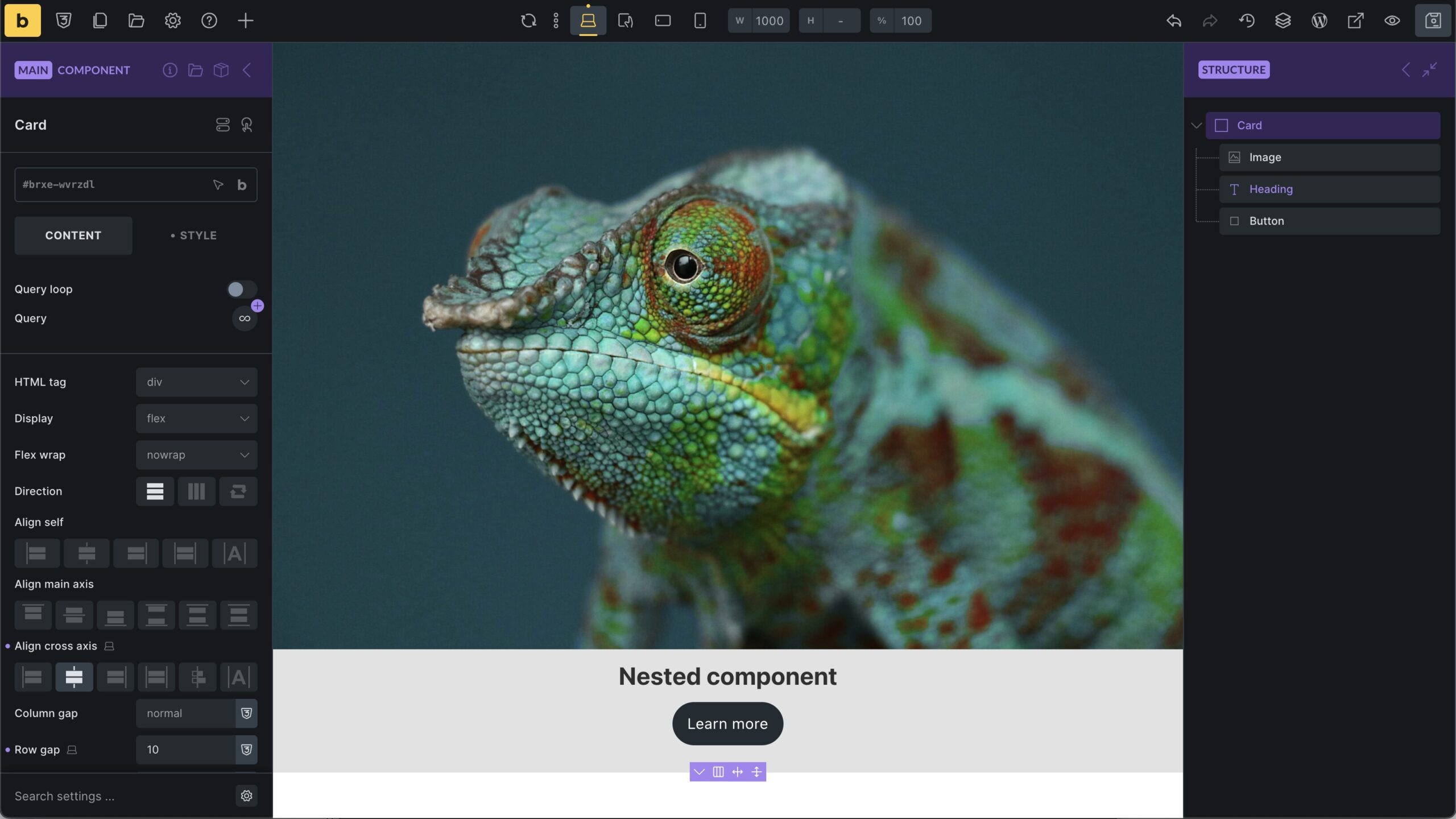
Bricks 2.0 brings support for nested components. Below you can see a Card component being edited. Within this component, we’ve got another Heading component.
Components leave the experimental stage
Starting at the final Bricks 2.0 release, components will leave the experimental stage so you can start using them on your live sites.
BREAKING CHANGE: Cascade layers enabled by default
Cascade layers (https://academy.bricksbuilder.io/article/cascade-layer/), introduced as an opt-in feature in Bricks 1.12, will be the new default behaviour in Bricks 2.0. Meaning all default Bricks styles are wrapped in @layer bricks, so you can override any default styles without problems or having to add !important rules all over the place.
This change takes affect according to the new Bricks CSS compatibility guidelines, which define the CSS features Bricks uses to adopt modern web standards when they’re stable and broadly supported, while avoiding unnecessary technical debt or regressions for the majority of our users.
Please let us know at help@bricksbuilder.io if you should experience any issues with this new default.
Although not recommended, if needed you can disable the Cascade layer default under Bricks > Settings > Performance > Disable Bricks cascade layer. We won’t provide style bug fixes resulted by disabling this setting as using @layer is the way forward.
DEPRECATED: Global elements
With the introduction of components in Bricks 1.12, we already announced that global elements will be deprecated in Bricks 2.0. So, creating new global elements in Bricks 2.0 is no longer possible.
Please convert all existing global elements into components using the new converter under Bricks > Settings > General > Global elements as soon as possible as we will remove global elements render completely in a future 2.x release.
More highlights
- Variables manager: Auto-rename variables site-wide
- Metabox and ACF Icon field integration
- Components: Support for Conditions
- Query Filters for WooCommerce
- Fullscreen code editor
Full changelog
- Bulk-edit elementsNew
- Icon Manager (In-Builder)New
- WooCommerce – Product Variation SwatchesNew
- Selector DetectorNew
- Builder CapabilitiesNew
- Inherited Setting IndicatorNew
- Form: Webhook (action)New
- Map: Query Loop & Sync with queryNew
- Font Manager (In-Builder)New
- Visual CSS Grid BuilderNew
- Form: Input fields min/max character limit validationNew
- Element ManagerNew
- Offcanvas: Setting “Open by default”New
- Offcanvas: Open and close transition controlNew
- Pseudo UI: New locationNew
- Selector UINew
- ACF & Meta Box: Icon field integrationNew
- Accordion Nestable: Collapsed/expanded icon settingsNew
- Builder: “Settings” panel quick linksNew
- Builder: Show Query Loop Object type (easier to recognise fields with the same label)New
- Cascade layer: Enabled by default (plus setting to disable it)New
- Components: Support for ConditionsNew
- Contextual Spacing (Theme Styles)New
- Converter: Global elements to componentsNew
- Query Filters: Disable URL parameters for specific queryNew
- Filter Range: Disable dynamic auto min-max valueNew
- SVG styles: Support breakpoints & classesNew
- Image Gallery: New attributes “loading” and “fetchpriority”New
- Maintenance mode: Exclude posts setting & Filter bricks/maintenance/should_applyNew
- Nested componentsNew
- New Dynamic Data Tag: query_results_count_filterNew
- New filter: bricks/frontend/render_elementNew
- New page setting: Disable popupsNew
- Query Filters for WooCommerceNew
- Rocket Loader Detection & Bricks setting to disable itNew
- Variables Manager: Auto-rename variables site-wideNew
- post_terms_xxx: Output slug or term_id via filterNew
- Query Bricks data in search results: Searches irrelevant meta keyImprove
- Bricks Template shortcode: Don’t render if template is not publishedImprove
- Bricks settings: Deprecate 1x. converter optionsImprove
- Builder: UI overhaul (better contrast, etc.)Improve
- Builder: Don’t re-render parent query loops if parent loop is busyImprove
- Builder: Execute element conditions (in static areas)Improve
- Builder: Remove unnecessary rerender on flex-direction controlImprove
- Code execution info pointing to incorrect settings locationImprove
- Default styles: remove word-wrap: break-word from bodyImprove
- Enqueue Bricks RTL CSS files lastImprove
- Filter – Range: Slider supports decimal and custom step for slider modeImprove
- Filter element should be removed from custom DB if deleted from a pageImprove
- Form element: map_fields for repeater controlsImprove
- Improve assign template hook unnecessary queryImprove
- Large amount of links on the same page causes performance issueImprove
- Load Bricks global custom CSS lastImprove
- Loop marker: Invalid aria-hidden attributeImprove
- Map element: rRemove jQuery function to avoid inconsistent close icon & behaviourImprove
- Map marker (A11Y)Improve
- Map: google.map.Marker deprecation & JS API loading (console warnings)Improve
- Query loop: Use data attribute instead of template tag to denote loop startImprove
- Skip link: iOS and ChromeImprove
- Updated: Google Fonts libraryImprove
- bricks-flatpickr-l10n JS files host locallyImprove
- get_the_excerpt calls get_post twiceImprove
- WPML: Update post & category IDs in template conditionsImprove
- Accordion: Expand by index not working for double digitsFix
- Active Filters: Empty value if “Filter – datepicker” is activeFix
- Builder: Attribute value added via setting not removed correctlyFix
- Builder: Remote template insert: Global classes not applied on query loop elementsFix
- Can’t connect filter to component with query loopFix
- Cascade layer: Gutenberg Gallery column widthsFix
- Cascade layer: Nestable slider pagination button marginFix
- Classes conflict with Sync Global Class causes JS error on saveFix
- Copy/Paste/Delete actions create ghost elements/leftoversFix
- Dynamic background: Empty DD value overwritten randomly when query filteringFix
- Empty ACF taxonomy field (Return term object) might cause wp_pluck_list warningFix
- Filter – Radio: Change from button to radio mode does not update correctly (in builder)Fix
- Filter Checkbox: Filter by Post author not workingFix
- Form: Switching from Type Password + Password Toggle to Type Text breaks formFix
- Import component: Code element remove extra backslashesFix
- Import pasted image/SVG with dynamic data or custom URL become placeholderFix
- Form: Incorrect DD in email (in popup within query Loop)Fix
- Mobile menu: When vertical scroll, it will close on mobileFix
- Nested Query: Term outer – Post Inner no result (in builder)Fix
- Page/post as draft add filter elements causing multiple records in custom DB (corrupted)Fix
- Pie Chart: PHP warning if percent or text is emptyFix
- Polylang: Query loop missing terms (include/exclude) if the taxonomy is not translatableFix
- Product Content: Not rendering “embed” shortcodeFix
- Query Loop: Settings Cross-Sell will show all products (even if none defined)Fix
- Show outer post: SVG with source code breaks builderFix
- Template assigned to hook not running in Bricks frontend API endpointsFix
- WooCommerce: Empty cart global class styles not generatedFix
- Nested query inside Dropdown breaks HTML layoutFix
- Query Loop: Additional empty “li” inside the dropdown (if using query loop)Fix
- Import pasted image: Paste on Canvas is not workingFix
- Cascade layer: Issue with audio elementFix
- Cascade layer: Nestable tabs all panes visibleFix
- Components: CSS classes not added to the main element (in builder)Fix
- :where causing issues on older browsersFix